My Camera Stories

My photos and the stories behind them

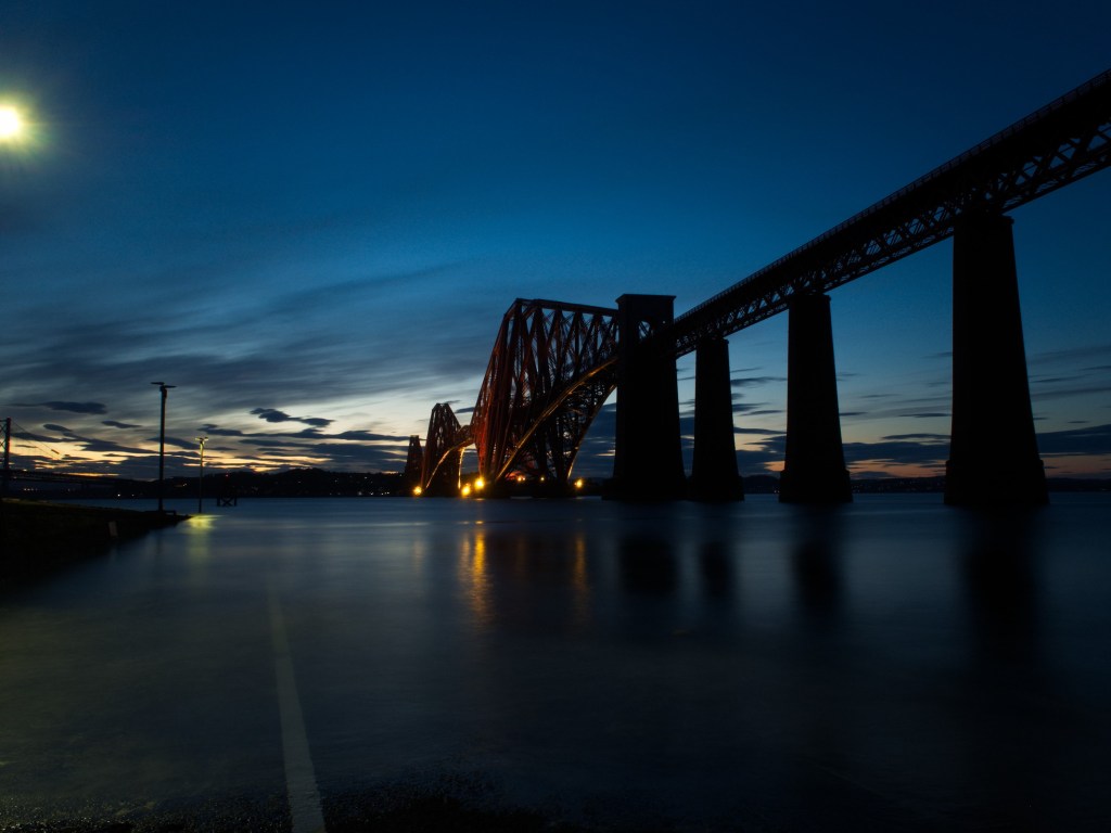
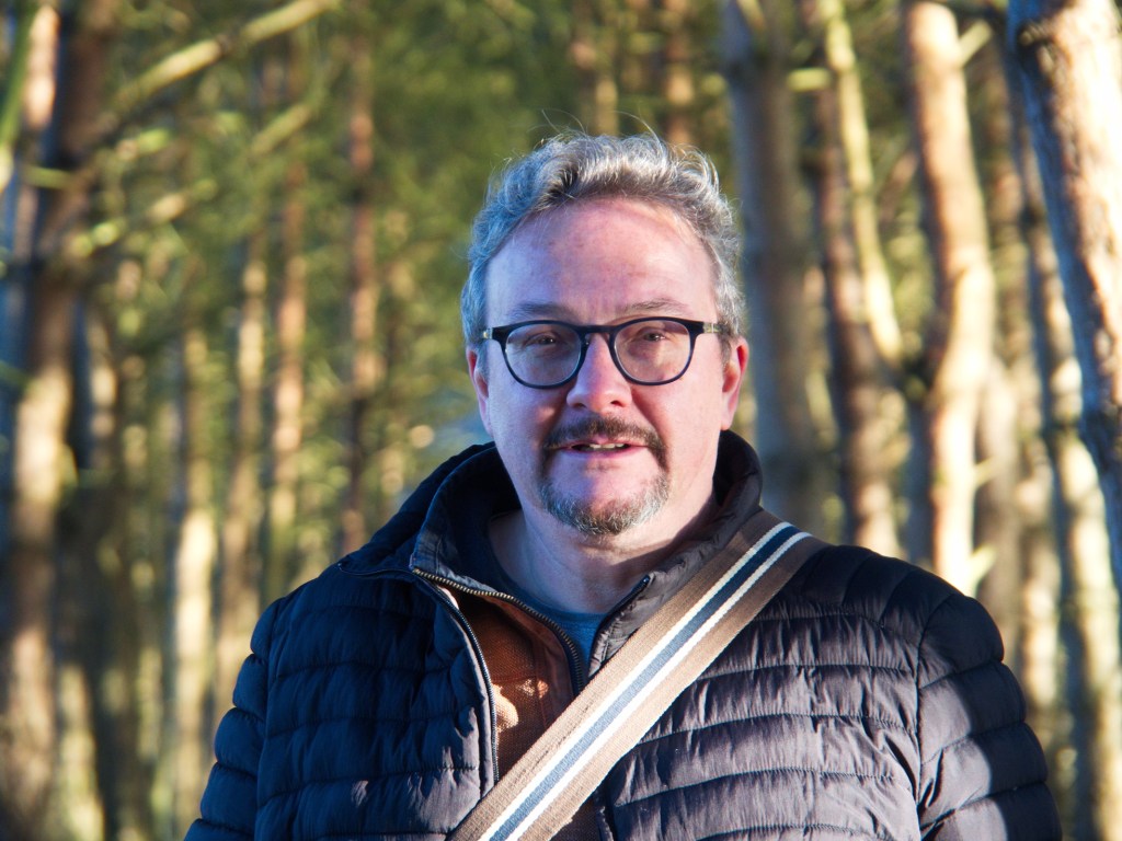
  • Once a fortnight, I meet up with a group of friends and we head out with our cameras to enjoy some photography. And of course coffee. We’ve been doing this for many years, so even in a city as beautiful as Edinburgh, we’ve photographed pretty much everything there is to see. Usually several times.

    We’ve learned to deal with this by setting ourselves a theme. Nothing too ambitious, just a gentle prompt to help us see our surroundings in new ways.

    So I found myself recently in Inverleith Park. This isn’t usually a fruitful venue for me. Many times I’ve walked through on my way from Stockbridge to the Botanic Gardens, and not even bothered to take the camera out of its bag.

    This time was different. I had a theme. And so, armed with the thought that I was looking for “lines”, I found them everywhere.

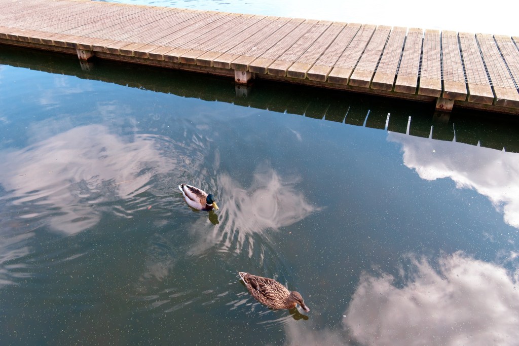
    What I like here is the three groups of strong lines: the strong diagonal line dividing the photo into thirds, the parallel lines formed by the edges of the boardwalk, and the perpendicular repetition of lines separating the individual planks. Of course those elements aren’t the whole photo. The two ducks, floating through the clouds reflected in the smooth surface of the water, add an organic whimsy to the frame, contrasting with the strong geometry elsewhere. It’s a very satisfying image, but without the theme to work to, I doubt I would ever have taken it.

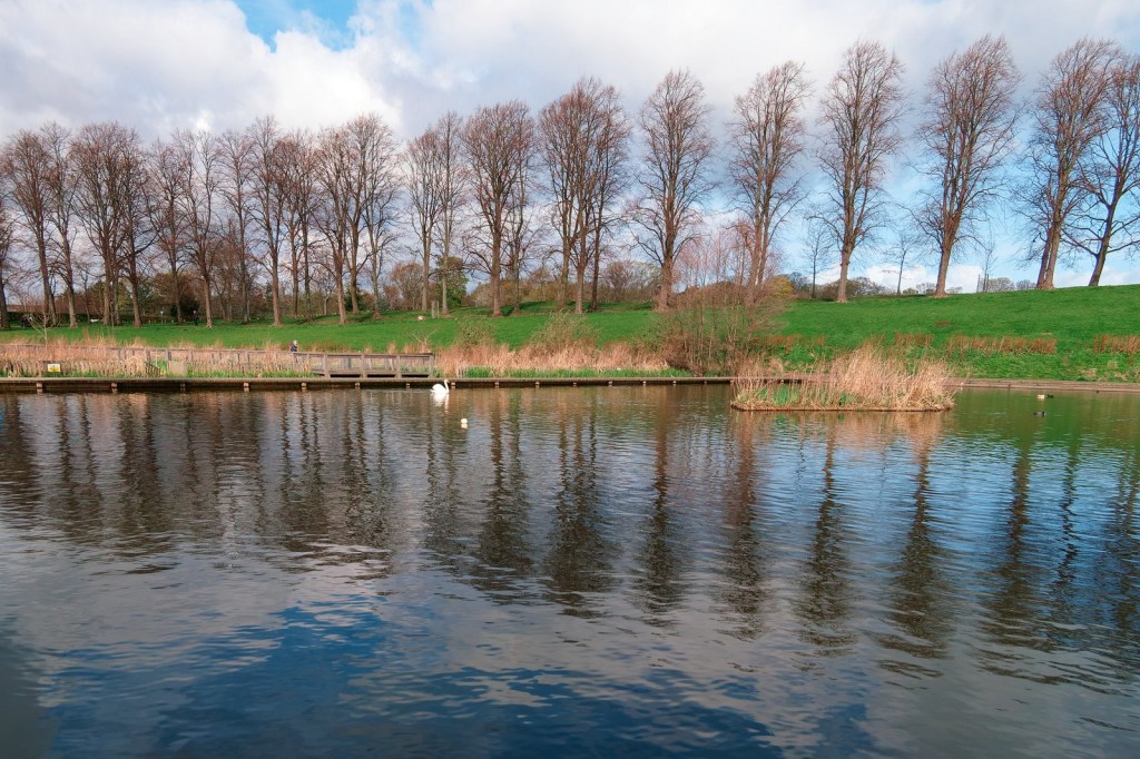
    There’s maybe too much water here, but I was trying to capture the reflection of the line of trees on the horizon. Again there are multiple lines here. The pond’s edge provides a central line between the distant boardwalk and the wee island in the middle ground. Meanwhile on the horizon line, there are multiple lines of trees running in different directions.

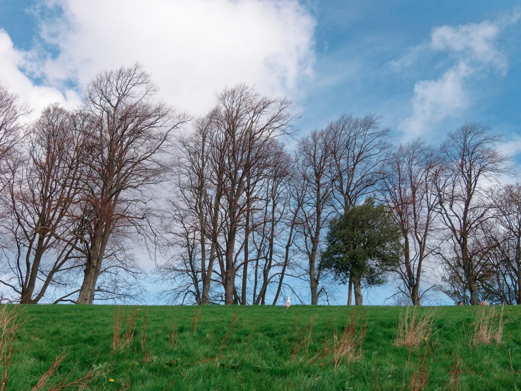
    This is probably the only photo out if this panel that I would have taken anyway, even without the theme to guide me. It’s a very simple two layered composition with a strong line of trees echoing the image’s main compositional hook: the green horizon line which splits the images into thirds.

    Overall, I was happy with my themed photo-shoot at Inverleith Park. The first image, of the ducks, was particualtlu successful. Strong colours accentuated by even stronger lines, all contrasting with the organic shape of the ducks floating in the clouds. And without the theme to guide me, I would never have taken it.

  • How do you manage your photos? You do manage your photos, right? Whether you use Digikam, Lightroom, ACDSee or even Windows Explorer, you have a system?

    Maybe you organise your photos by date. One folder per month, or one folder per photoshoot. Maybe you completely ignore folders, relying on your DAM to keep them in order.

    Maybe you keep your RAWs and JPGs in the same folder with the same filenames. Maybe you develop the RAWs and then discard them, preferring to archive the JPGs. Maybe you have completely different folder structures for RAWs and JPGs.

    All of these are perfectly valid choices. What they all have in common is that they’re all file management. They say nothing about your art.

    Managing your photos might mean keeping every photo you’ve ever shot, carefully stored in annual folders and backed up to three different locations. It might mean keeping a stack of 35 near-identical shots of a nesting bird, with the best shot carefully moved to the top of the stack.

    Curating is different. It’s more subjective, it’s more subtle, and it asks some very difficult questions. Is this photo worth keeping? Does this image rely on other images to tell its story? Sometimes even – is this photo worth keeping?

    A screenshot from ACDSee showing a gallery of photos. Individually, these are just record shots. Viewed as a sequence, they tell a powerful story about saving household waste from landfill and using it to generate electricity. This is my final selection from a much larger photoshoot. Alternative photos, rejected photos, and RAWs are all stored in another folder.

    For an analogy from analogue days, managing photos was about carefully filing the negatives and then stuffing the unwanted prints – still in their envelopes – into a sideboard drawer. Curating was about carefully selecting your favourite photos and placing them in an album.

    In the digital era, managing photos is about ensuring that all your photographs are stored securely and that you know exactly where they are. Curating your photos is about understanding why you keep them and ensuring they tell the stories that are important to you.

    So how do you do that? Social media is the obvious answer. Facebook galleries, Instagram reels. But the lifecycle of a Facebook gallery is measured in hours. Your friends might open the gallery when it’s first published, like a few photos, and then completely forget about them.

    For a more permanent way of curating your images, photobooks are a great choice. Old-school photo albums work well too. (You do print your photos, right?) You can use anything, really, that turns your photos into a story.

    For me, I use a digital photo frame. Or more accurately, an old Android tablet repurposed as a digital photo frame. I’ll return to that in a future post.

  • I’ve lived in cities all my life, but living in Edinburgh is a completely different experience from the hustle and busyness of London’s West End. I was in London for a few days on business so my free time was restricted to an hour or so in the evening, before a rushed dinner with my colleagues and a swift return to the hotel to prepare for the next day.

    I’ve always relied on my camera to unwind when I’m in a strange city. A gentle relaxed walk, camera in hand, documenting the novelty of a new day in a new town. What I wanted was a wander through St James’s Park, enjoying the autumn colours as the trees gently signalled the coming of autumn. With twilight giving the parks a slightly uneasy, ambiguous feel, I decided instead to photograph the relentless energy of the West End.

    Making my way to Trafalgar Square I photographed all the cliché shots – the lions, the National Gallery, the water fountains. The photos were … okay. Record shots. Nicely done, and with the approaching blue hour giving great light. But ultimately they were snapshots.

    Making my way to the south side of Trafalgar Square and looking down Whitehall, a police van was making its way through the congestion. Blue lights flashing, sirens blaring. Of course drivers and pedestrians made way, allowing the vehicle free passage through the busy road. But no-one was particularly interested. In a large, heavily populated city, strangers are largely anonymous. Someone else’s emergency. Just one of thousands of emergencies that took place every day. And you couldn’t possibly pay heed to every one.

    I often think about the incident this van was rushing to. Was this a big interruption for someone whose life continued normally the next day? Was it a life-changing moment for a whole group of friends and family?

    The next day, of course, I was back in the corporate world and I gave it no more thought. Except, from time to time, when I look back at this photograph and wonder.

  • In my last post, I wrote abut the challenges of processing RAW files in ACDSee Photo Studio. The software has a great raw developer. The colour grading tools, in particular, are powerful and easy to use. But unlike many RAW developers, ACDSee Photo Studio doesn’t apply a default “look” to the RAW files as it imports them. In many ways this is a strength, leaving you free to decide exactly how you want the image to look. But it is also, on occasion, a weakness, increasing the amount of work you have to do to get a useable JPG from the RAW data.

    To get round this challenge, I’ve started creating my own develop presets for my own most frequently-used cameras, starting with the Olympus OM-D E-M10 Mark II.

    The Olympus OM-D E-M10 Mark II is a 16 megapixel camera, launched in 2015. This preset is designed specifically for that particular model, but should work well for any Olympus camera with a 16 megapixel sensor. In this post, I will:

    • Take you through the preset step by step, explaining why I have chosen those particular values and giving you all the information you need to replicate the preset
    • Explain the limitations of the preset, and what you will still need to do even after using the preset
    • Provide four example images, allowing you to directly compare the original Olympus JPG with a version processed using the ACDSee preset
    • Provide a downloadable copy of the preset
    • Give clear instructions for importing the preset to your version of ACDSee Photo Studio.

    Sounds a lot, right? No worries, we’ll go through it step by step.

    IMPORTANT NOTES

    • RAW developing is only available in ACDSee Photo Studio Professional and Ultimate. ACDSee Photo Studio Home does not have a develop module, and can not be used for processing RAW photos.
    • These instructions apply to ACDSee Photo Studio Professional and ACDSee Photo Studio Ultimate. They have not been tested in ACDSee Photo Studio for Mac.
    What settings does the preset use?

    General Tab

    • Exposure + 20
    • Highlights -26
    • These settings slightly increase the exposure, and then pull back the highlights to avoid clipping
    • Vibrance +10
    • Subtly increases saturation without affecting skin tones
    • Clarity +4
    • Improves local contrast
    • Light EQ adjustment
    • Pulls back slightly on the very brightest parts of the image, reducing glare for very bright scenes
    • Tone Curve
    • A gentle S Bend to gently add contrast

    Detail Tab

    • Adds some subtle sharpening and noise reduction

    Geometry Tab

    • Not used – see the explanation below
    Lens corrections, and other things you will still need to do manually

    ACDSee Photo Studio isn’t always very good at identifying the lens used for lens corrections.

    Quite often, the lens identified in the View mode won’t be picked up by ACDSee in Develop mode. It’s a frustrating limitation which means that automated lens corrections in ACDSee Photo Studio can be a bit hit and miss. A much more reliable approach is to manually identify the lens in View mode (using the EXIF panel) and then manually select the correct lens for your image.

    Important: remember to also select Vignette Correction in the Geometry tab.

    Always remember that the settings used here are just a starting point.

    • Some lenses are sharper than others, so you may need to adjust the sharpness settings to suit your images
    • Photos taken at high ISOs or in low light, will contain more image noise, so you’ll need to increase noise reduction when this applies.
    • And remember to have fun. Presets aren’t “one size fits all” so tweak the settings as much as you want.
    Example images

    The ACDSee preset (left) is a little punchier, but the overall look of both versions is very similar.

    The two images here are very similar. The ACDSee version (left) includes slightly more of the scene, due to differing lens corrections being applied.

    The Olympus version (right) is the clear winner here, with more accurate reds on the pheasant’s face. The ACDSee version would need further editing to match the Olympus colours.

    This time the ACDSee version (left) is the clear winner due to the increased clarity. Both versions need more work on the highlights to produce a more balanced image.

    Where to download the preset

    Download the preset here

    How to install the preset
    • Go into Develop mode
    • Look for the Develop Presets pane
    • At the bottom of the Develop Presets pane, look for three icons
    • The middle icon shows an arrow pointing into an open box (it’s immediately to the right of the + icon)
    • Click this middle icon and follow the instructions onscreen
    Have fun!
  • RAW processing in ACDSee hits a little different than some other RAW processors. In most RAW software, the processing engine applies a default preset to the RAW file. In many cases, this immediately gets the photo to a stage where it’s usable.

    If you’re in a rush, you can import the RAWs, let the software apply its default preset, and immediately export the JPGs. Simple. Got a bunch of party snaps you want to share on FaceBook the minute you get home? Done in one. Just home from a holiday and want to quickly look through all your photos on your big-screen laptop? Done.

    Lightroom works that way. So does On1 Photo RAW, RAW Therapee, and DxO Photolab. Lots of RAW software works like that. But not ACDSee Photo Studio. In ACDSee you import your RAW files, and ACDSee does absolutely nothing to them.

    Of course, look in the Develop module and there are lots of presets in ACDSee. Look more closely and you’ll see that they work quite differently from the presets in most other applications.

    Sure, there are lots of presets, but they’re mostly designed around a specific task: add clarity, add a vignette, denoise, add punch. And again unlike other RAW developers, the presets are additive. Add a new preset and – unlike most software – it doesn’t replace the previous preset, it stacks on top of it.

    All of this behaviour is by design. ACDSee Photo Studio starts you off with a relatively neutral, low-contrast rendering rather than a punchy, ready-made look, so the image can appear a little flat at first. The upside is that you retain full control over how the photo is shaped; the downside is that if you want a quick, reliable starting point that will give you a usable result straight away, you’ll need to create it yourself.

    Well, I’ve been thinking about this a lot recently so over the last few weeks I’ve been working on a preset for the Olympus OM-D ME10 Mark II which acts similarly to the default preset in many other RAW developers. In other words, it’s not intended to directly mimic the straight out of camera JPGs. But it should be good enough to export usable JPGs if you need them quickly, and it will act as a starting point for more advanced editing when you have more time to devote to it.

    With minor tweaks, my preset could easily be used on RAWs from any of Olympus’ 16 megapixel cameras.

    In my next post, I’ll take you through exactly how I did that, and share the preset for download.

  • Back in the day, my favourite film to shoot with was Agfa Ultra 100. It wasn’t a subtle film. The colours were punchy, saturated, and – so far as greens were concerned – often quite unrealistic.

    This photo shows all the characteristics of Agfa Ultra. The deep cyan-blue, the warm reds in the masonry, the gentle roll-off of the shadows; and, crucially, the neutral white of the road sign.

    It also shows, even for Agfa Ultra, an intense level of saturation in the sky. Looking at that shocking blue, combined with the lack of any glare or reflections on the enamel sign, I’m pretty sure I must have been shooting with a polarising lens. The effect is striking, creating an almost surreal hyper-realism.

    Back in 2003 when I took this photo, there’s no way I would have done any editing on it. What you see here is the raw scan from the Kodak CLAS HR200 scanner which was used in the processing lab. Look closely at the EXIF and you’ll see it’s been saved in ACDSee, but that was a simple resizing exercise. No editing required.

    To answer my own question from the heading: how much saturation is too much? This is. I’d never saturate a digital image as much as this. Film though? Agfa Ultra gets away with it, by the skin of its teeth.

  • Alfred Buckham, Daredevil Photographer was the name of a photographic exhibition at the Scottish Portrait gallery in Edinburgh. If you don’t recognise his name, you’ll probably recognise his most famous photograph.

    Aerial view of a historic cityscape featuring a castle on a hill, with an old biplane flying in the sky and dramatic clouds overhead.
    Edinburgh, by Alfred Buckham, used with permission of National Galleries of Scotland.

    Yes, that’s a biplane flying over Edinburgh castle, with Arthur’s Seat in the background. Yes, it was before Photoshop was invented. No, it isn’t real – though I agree it’s very impressive.

    The exhibition was very informative about how Buckham created these collages, and it’s as straightforward as you’d expect. Take an aerial shot of a landscape and collage it with a separate photo of a big sky. Dodge and burn the join between the two images so that it looks like a single image. Cut out the silhouette of a plane from another photo and place it on top of the existing collage so that it all looks like a single, cohesive, whole.

    Simple, of course, is a matter of degree. Yes, it’s easy to describe the technique, but matching the sky to the landscape, adding in the aeroplane, making it all look real is … challenging. I tried it in Affinity Studio – a powerful piece of software far in advance of anything available to Buckham in those analogue days – and my results were distinctly average. After several hours of work, nothing I tried would make the individual elements adhere together as a believable image.

    Yes, it’s collaged from three photos, just like Alfred Buckham’s photo. Yes, I took all three photos. Yes, you’re right, you can clearly see the join. Oh well, I had fun, and I’ve identified a project for a future rainy day.

  • North Berwick is a pleasant 35 minute train ride from Edinburgh’s Waverley Station. I go there regularly for the coffee shops, the busy high street, and of course the sea views. What I don’t go there for usually is photography, because the setting is all too familiar to me,

    Normally this isn’t a problem. Yes, form time to time I see things that make me think “that would make a great photograph” but that isn’t why I’m there. Relaxation, and a break away from the city, is my reason for being there. Occasionally though, a scene presents itself that just demands to be photographed.

    That’s what happened when I was there earlier this month at high tide, on a day when the storm swell sent waves crashing over the Old Pier.

    What do you do in this situation when you only have a mobile phone? I braced my phone against a guardrail and shot a series of frames, timing them for maximum drama. Of course my very ordinary phone took a set of very ordinary photos but I knew there was something there.

    Arriving home, I selected the four most promising frames and imported them into Affinity Studio as an image stack. That’s where the movement of the waves comes from. By importing them into Affinity Studio as an image stack, the default “median” setting blurs and softens the movement of the water, creating a long-exposure effect that normally would require a serious camera with a tripod.

    Nice, but next time I hope I remember my camera. It’s a lot easier than doing it all in post.

  • With the weather being dreich and grey, my camera group today visited St Giles Cathedral, on Edinburgh’s Royal Mile. The theme was Texture. Whether that’s the same theme as Textures, or something different, is maybe something to explore another day.

    St Giles Cathedral is rich in textural detail, and my Panasonic Lumix 12-32mm lens was ideal. Long enough to pick out detail. Wide enough to capture the grandeur of the building. This shot – of a decorative screen in the west nave – was intended to pick out the multiple textures of the carved wood.

    Oh, the textures are there. Subdued raking light picks out the surface relief of the carved oak – all the wee details of the oak leaves and acorns. The warmth of the light makes the gold leaf of the angels’ wings shine brightly and reveals the details of the carved feathers. The matte paint of the angels’ robes provides a counterpoint to the more obvious textures, a peaceful spot for the eye to rest. But my usual passion for symmetry has clashed with my intention to foreground the textural elements. Framed head-on, the story told by the three angels is about architecture, symmetry, and repetition. The photo captures how the scene looks, but it doesn’t invite us to lean in and explore the textures.

    For all that, I’m satisfied with this image of a detail that many people pass by without even noticing. Cathedrals are full of details like that.

  • Many visitors to Tuscany bypass the town of Pietrasanta. There is no single, iconic sight associated with the town. The appeal comes from small galleries and workshops. Temporary exhibitions of sculpture, usually featuring the local Carrara marble.

    And partly, perhaps, that’s because there’s no direct train from the main tourist hubs – from Florence, Cinque Terra, or Lucca, you will need to change trains at Viareggio or Pisa. But if you’re based in Pisa (which I recommend, by the way, for travellers exploring Tuscany by train) a simple 30 minute train journey takes you right into the heart of the town.

    We went there to view the exhibition Human Connections by Filippo Tincolini. Tincolini is a contemporary sculptor who mixes traditional craftsmanship with modern symbolism, often using humour and pop-culture imagery. And we were incredibly fortunate to be offered a guided tour by Filippo Tincolini and Laura Veschi, the photographer who has documented the human stories behind the sculptures.

    Of course I took my camera – a small Canon compact – to document my own reactions to the artworks. My favourite piece of the day was Hand of Justice, part of Tincolini’s Ancient Gods series which uses modern superhero symbolism to recontextualise classical sculpture. But the first photo I took was very average.

    A large marble sculpture of a hand making a 'number one' gesture, set on a decorative base, with buildings and a seated person in the background.

    I was attracted to this angle because of the sense of age around the base – the distressed marble cut away from the gauntlet- and the artist sketching in the background. It tells a story of two artists collaborating, or perhaps following parallel paths. But no, there was a better story to be told. Filippo put his hands on my shoulders – his English is no better than my Italian – and directed me to another angle where I was standing directly behind the Hand of Justice.

    From this angle, with the Church of Sant’Agostino in the background, the photo tells a completely different story. A story of defiance. Of conflict between art and religion. Of classical sculpture being used to tell modern stories. I wish I could take the credit, but it was the artist who, quite literally by sculpting my movements, led me to this story. It was a magical moment.

    Interestingly, the exhibition catalogue tells yet another story. It places the sculpture in the context of the piazza, which makes me reappraise the piece again. This time, I see it as a classical sculpture, reacting to the marble and the craftsmanship, and not to the artist’s intentions.

    An open book featuring two photographs of intricate sculptures on the left page and a view of a tall, historic bell tower and buildings in a square on the right page. A hand is seen holding the book.

    Three angles, three ways of seeing. Three stories.